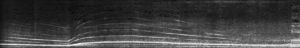
Spectrograms are pretty cool. They’re handy tools to lend eyes to ears, and give a glimpse into what strange textures exist in the world of sound. In this case, everybody’s favorite sound of sirens leaves behind the dominant signature in the spectrogram. But what makes spectrograms even more useful is how they pick up an array of idiosyncrasies within a recorded scene. Check out the diagram below to see what else exists in the cacophonous 8 second sound sample.
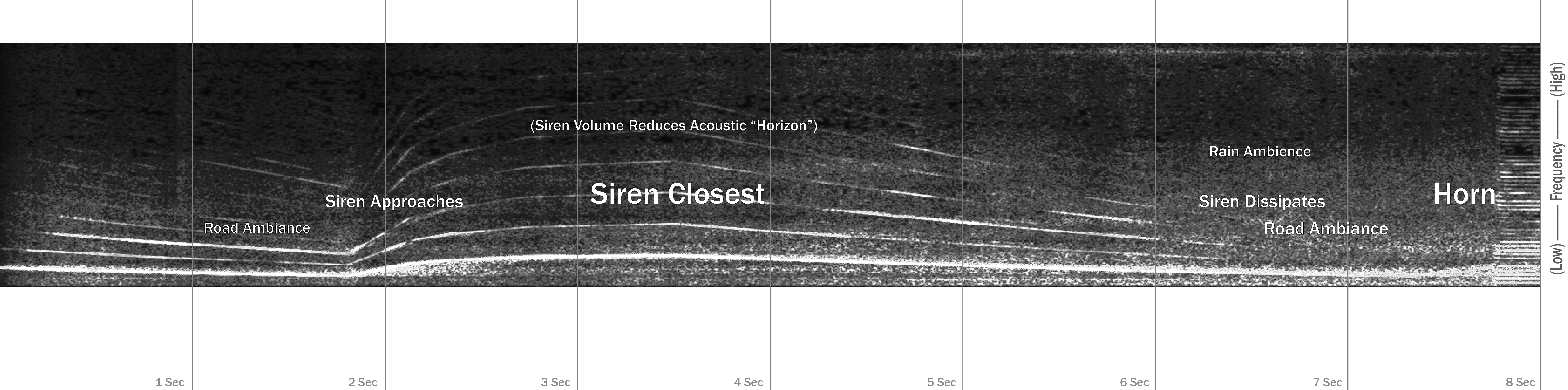
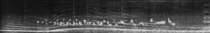
Having the visual aid of a spectrogram makes it clear that though dominated by a siren, the audio clip is far more dynamic – the siren approaches and dissipates, either covering or revealing various ambiance from the scene. A more complex clip with other sound sources, would yield an even more information rich spectrogram. To show this, here is the same siren clip only this time with bird sounds spliced in.
So what does this have to do with the price of beans in the design world and empathetic design? Here are some questions for that question…
Do sites have signature sound profiles? How consistently do these profiles appear across various sites?
Can spectrograms provide a visual aid to understanding whether sites are inhospitable or welcoming in terms of volume or tones?
Are there more ideal spectrogram profiles that can be designed?
Do they look awesome?
We’ll keep you posted!